Background
TeePublic is an e-commerce marketplace featuring user-generated artwork on products that customers can purchase from anywhere in the world.
Problem-Space
There were two problems our product team set out to solve:
1) Reduce delivery errors with domestic customers
2) Reduce accounting errors as a result of incorrect shipping addresses
Discovery & Opportunity
Our product team decided to implement an external service which would add address validation to the checkout experience. For anyone who has shopped online in the United States, address validation is the step in which a user is asked to confirm their shipping address, which is then validated by the United States Postal Service. The flow is frequently implemented in a variety of ways.
Design Process
My responsibility included researching and designing how this would seamlessly fit within the existing checkout flow on TeePublic, in a way that would minimally impact completed orders. The overall design process included mobile-first wireframing and high-fidelity mockups, unmoderated user testing using Maze (with real TeePublic customers), and collaborating with the engineering team responsible for implementing the feature. I also heavily utilized Baymard Institute’s exceptional e-commerce research for research-backed guidance and examples.
Solution
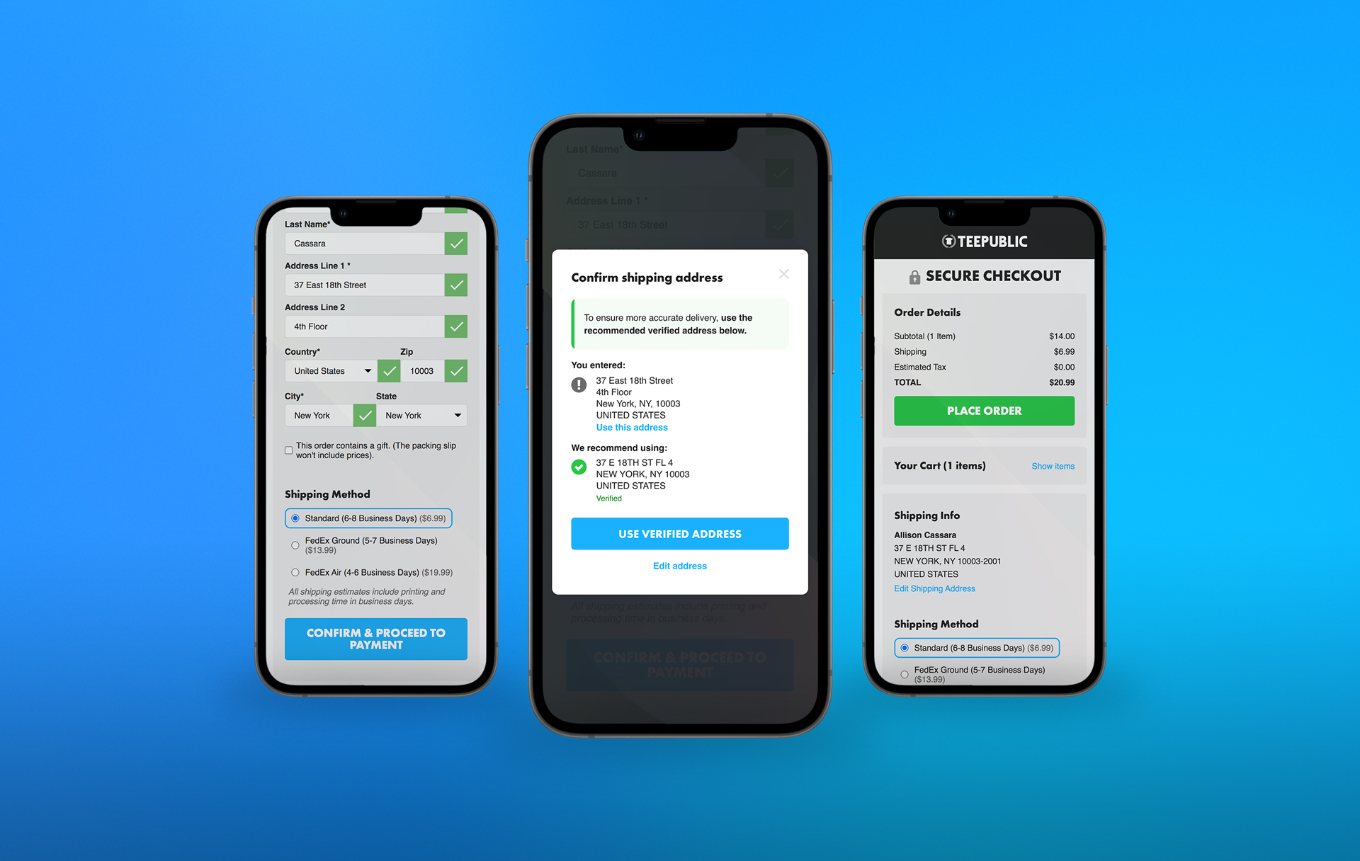
Given the project time constraints and technical limitations, the team had to keep the MVP as simple as possible. It consisted of a newly updated 2-step checkout flow and used a radio picker for address selection. A year later, we revisited this design and after user testing, updated the modal to put more emphasis on selecting the validated address.
Outcomes
At the conclusion of QA testing, the MVP (V1) was released to 10% of users before fully rolling out to all traffic. The team measured success by looking at overall order conversion rate and a reduction of order delivery issues. The MVP resulted in a 0.5% boost in conversion rate for the users in the test group, and the V2 (a year later) resulted in a 1.0% boost in CVR for users the test group. Overall, it also reduced the number of lost packages by an estimated 5%.
Learnings
Our team hypothesized that the boost in CVR could be attributed to a streamlined mobile-first experience, where the validated address is condensed into a more easily readable section of content (instead of continuously showing all address fields).
Visit TeePublic →
Features
- E-Commerce
- Figma
- Maze
- Prototyping
- UI Design
- UX Design
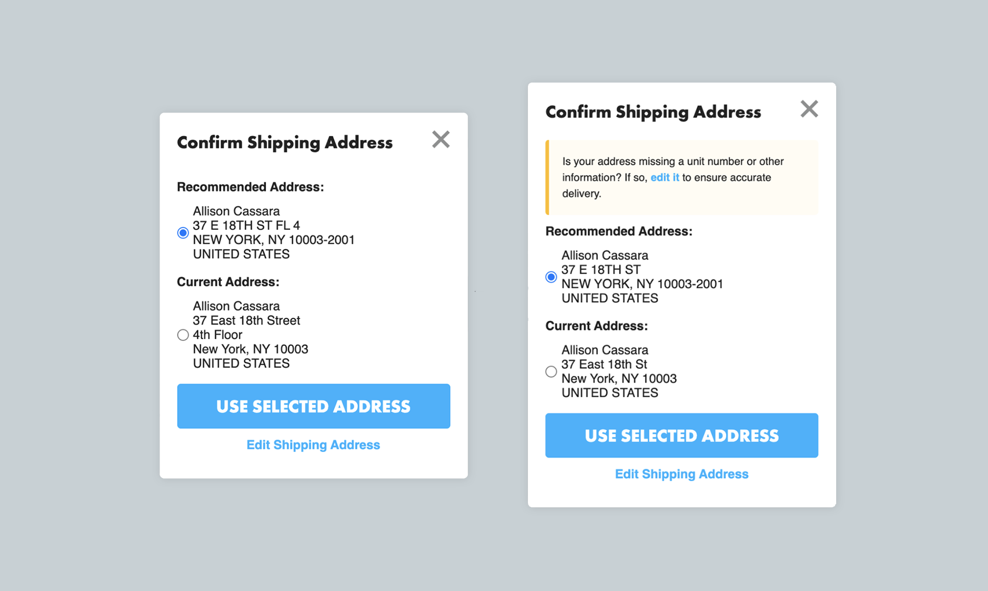
V1 Modal (MVP) / The MVP of the modal was not the most aesthetically pleasing, however it allowed the team to quickly ship the feature in order to support ongoing business initiatives.
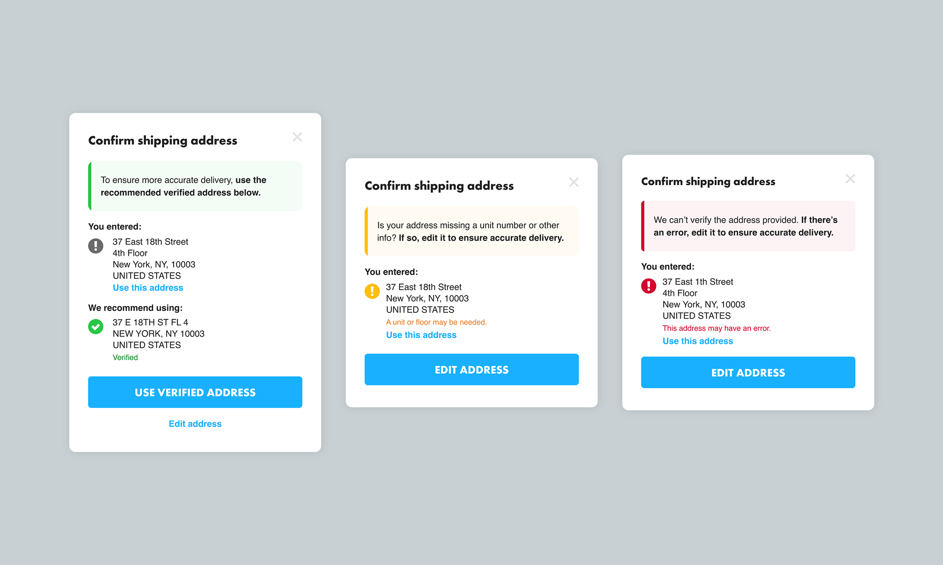
V2 Modal / V2 had an overall improved look-and-feel and improved customer use of selecting the recommended address. Improvements included a clearer call-to-action and use of color and icons to improve messaging.
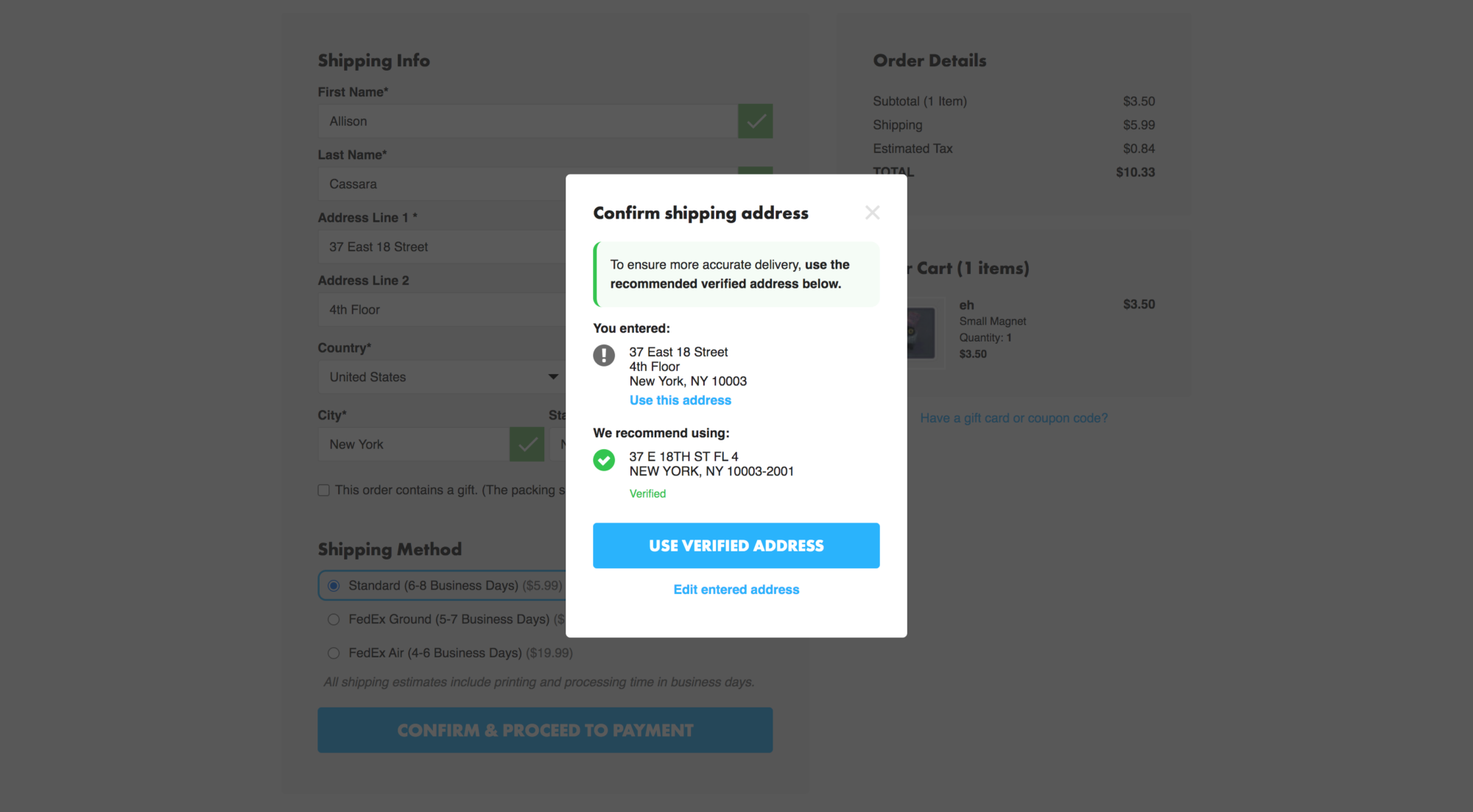
TeePublic Checkout / A live example of the V2 address verification modal appearing after inputting an address.